To Think or Not To Think: Happy Website Users Prefer Not To
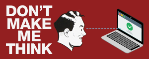
In his book, Don’t Make Me Think Revisited (2014), Steve Krug defines a usable website as one that a person of average web experience (or even below average) can figure out how to use to accomplish something without it being more trouble than it’s worth. In other words, the user should not have to think while using the website, or at least should have to think very little. Krug discusses many site design features that improve the user experience. In this blog, two key categories are discussed.
Scanning Pages
People don’t read pages, they scan them. They look for things that catch their attention because they don’t want to waste time, they’re not interested in every piece of content and they know that scanning works to find what they are looking for. Given this, websites need to be designed in a way that offers users what they want to know or need to see. Here is how:
1. Conventions Using existing conventions makes things immediately obvious. These standardized elements are easily recognizable by users, and include their location (e.g. logo in the top left corner); how things work (e.g. shopping cart graphic on e-commerce sites); and their appearance (e.g. magnifying glass for a search icon).
2. Visual Hierarchies Pages should clearly depict the relationship between the elements they contain. In an effective visual hierarchy, important things stand out more and related things are gathered together logically.
3. Page Sections Pages should be divided into obvious areas that allow users to rapidly determine what sections to pay attention to and which to ignore.
4. Obvious Clickable Elements Clickable content should be consistent and easily recognizable on websites due to their location, shape or formatting.
5. Minimum Distractions Easy to understand web pages are simple and uncomplicated. Such pages do not contain too many elements trying to catch the user’s attention; have well-aligned elements; and do not include too much information.
6. Scanning Format Users spend most of their time scanning websites. In order to enable visitors to scan more easily, use section headings, keep paragraphs short, use bullet points and employ proper formatting to highlight important content.
Navigating the Elements
Websites should allow users to easily find what they are looking for and know where they are on the site. Navigation is what tells people what the site contains and how to use it. It can also help the company make a good impression. Here are the elements of good navigation:
1. Persistent Navigation Some elements should appear on all pages of the website: utilities, site ID, search and sections. They let users know that they are still on the same website and it helps them quickly learn how the site works.
2. Site ID The site ID should appear on every page. It should ideally be placed in the top left corner of the site and should look like, or be, the company logo.
3. Home Page Link The site ID should be a button, allowing users to click on it and get redirected to the Home page.
4. Primary Navigation There should be sections linking to a website’s most important pages in the main navigation menu.
5. Utilities Four to five utilities should normally be present in the top right corner of a site and should be les prominent than the main sections. They are there to either help use the website or provide information about its publisher.
6. Search Websites should have a simple search function presented as a box, a button and the word “Search”, or a magnifying glass icon.
7. Discernible Page Names Page names are the street signs of the Web; they must be clearly visible in the main navigation and at the top of pages to easily orient visitors. They must be intuitively named, logically positioned, and consistently styled. In addition, the navigation labels and the page titles should match.
8. Accentuated Current Location A user’s current location should be highlighted in the navigation bar, list or menu that appears on pages. There are a number of methods to achieve this, but regardless of which one is used, be consistent and make sure the current location stands out.
9. Breadcrumbs Breadcrumbs show users the path from the Home page to their current location. They should be placed at the top of the page, a “greater than” separator should be used between page names (>), and the name of the current page should be in bold type.
User experience can make or break a website. Websites that do not focus on usability expose their company to lost sales, dissatisfied customers and disengaged employees. The goal of not making users think should be high on the priority list of any website publisher.