7 Habits of Highly Effective Web Designers
More often than not, businesses looking to build a website are thinking flashy visuals and fancy features. But when it comes to web design, it’s essential to remember your website is first and foremost a sales tool. For your site to be an asset to your business, it has to be effective. What does this mean? Your website needs to communicate a clear purpose, get visitors interested in your service or product, and be easy for them to get around.
Ready to create an effective website that generates leads and grows your business? Read on to discover the 7 habits of highly effective web designers:
1. Define a Purpose
First things first. Before you get into awesome graphics and super-snazzy widgets, you need to establish your site’s purpose. Are you trying to promote an eco-friendly lifestyle, showcasing award-winning indie films, or selling handmade iPod cases? Defining a purpose will help keep all the elements of your web design on track. When users lands on your webpage, they want to know they are in the right place. A site designed with a clear purpose tells a unified story and lets users know what they can find.
2. Stick to Conventions
While many web designers’ first goal is creativity, it’s important to never sacrifice usability. Your new site may look awesome, but if it’s frustrating viewers, it will be bad for business. Web design conventions are called conventions for a reason. Just like we expect the doorbell to be next to the front door, web users expect websites to look and function a certain way. These conventions help them navigate a site without having to think. There’s always room for creativity, but as Steve Krug says in Don’t Make Me Think: A Common Sense Approach to Web Usability, “think of how frustrating it is when one of these conventions is broken”.
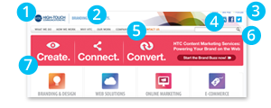
3. Make Navigation Easy
Visiting a new site is like landing in a new city. If you’re trying to get downtown, the easiest way is to look for signs that point you in the right direction. While you may know the ins and outs of your own company website, your visitors are foreigners. They’re looking for signs to get them to the page they need.
- Main Navigation Bar: Your main navigation that outlines the main sections of your website. Make sure it’s noticeable and easy-to-use.
- Calls-to-Action: Buttons and callouts that prompt user action are a good way to guide visitors down intended traffic funnels.
- Site Well: Displaying a site well provides users with a direct way of navigating to any page on the site.
- Breadcrumbs: Breadcrumbs are those tiny back arrows that allow the user to go back to the previous page or section. These allow users to go deep into your website without getting lost.
4. Include a Search Box
Some visitors to your site will want to browse around and learn more about your company. Others are coming with a clear goal in mind and the search box will allow these users to more easily access sought content. Say my local pet store closed and I need a new place to buy my dog organic pet food. Rather than scrolling through bowls and leashes and dog food of every variety, typing “organic” into a website’s search box will bring me exactly where I need to be.
5. Keep Text Short and Sweet
Whether its through headlines or the main body content, text is the primary way to communicate the message of your website. Clear wording is essential to making this message understood, and concise writing is key to ensuring it is understood quickly. If users are confused by your text or it takes them too long to get through they will become frustrated and leave. Keep website copy keyword rich and at a scannable length.
6. Provide a Powerful Call-To-Action
A call-to-action is your way of getting users past your homepage. It prompts them to do something, whether it’s learn more, sign up, contact us, or participate in a trial. An effective call-to-action button is the difference between traffic and customers. Be sure your call-to-action buttons stand out on the page without being overpowering. Keep language simple but exciting. Finally, use a font that is easy to read. An effective call to action should entice readers to click, and clicking is the key to converting visitors into customers.
7. Less Is More
There is no better way to lose visitors than website clutter. What you remove from your design is just as important as what you include. Just because there is room for a Twitter widget, a newsfeed, or a flying dragon icon in the footer, doesn’t mean you need one. With each image, sentence, button, link and widget you add, ask yourself, “Is this fundamental to my website? Is it reinforcing my site purpose?” If the answer isn’t yes, let it go.
Remember, your website is a tool that can help bring in more business – if done right. Put aside the animated logos and flashy backgrounds and focus on creating a site that helps users get where they want and find what they’re looking for.