Tips for Effective Logo Design
Business owners invest a lot in their company: office space, employees, materials, management systems, marketing, etc. All these things are important. But for whatever reason, many companies seem to believe that they can make do with a logo that was designed by their 15 year old nephew. The conversation might go something like this:
“Hey buddy! You’re amazing with computers and stuff. Can you make a logo for my company, XYZ Corp?”
“Actually, I’m more of a gamer ”
“Yeah, perfect! The graphics in those games are amazing. Anyway, I want the logo to look something like this:” (shows competitors logo)
“Yeah, I guess could do that.”
“Thanks! You’re the best!”
The unfortunate truth is that most companies don’t give enough importance to the quality of their logo. It’s unfortunate, because the logo is your #1 branding asset. It is the first impression a customer gets when visiting your website, when seeing your advertisements, when taking your business card and when walking by your store. It should not be taken lightly. If your logo looks cheap, so will your company!
Side note: why would you want your logo to look like your competitor’s and run the risk of people confusing your company with your competitor? Suppose someone had a bad experience with that competitor, would you want your logo to imply that you are like them?
Simple
The more elements you add to a logo, the less memorable it becomes. Keep your logo simple to make it easy to remember. If you have a graphic in your logo, you don’t necessarily need text, and if you have text, you don’t necessarily need a graphic. After all, some of the world’s best logos are also some of the simplest logos.
Versatile
A great logo looks just as good in black and white as it does in full color. It should look good as a small 16×16 pixel favicon on a browser tab, and just as good when it is a plastered on massive billboard off the highway. Your logo may appear on a number of different types of material other than your business card and website. How would your logo look on a cardboard box that can only have black print on it? A way to achieve versatility is to keep the logo simple and avoid relying on specific colors to make the design work.
Timeless
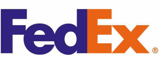
Swooshes were cool in the 80’s. Bevels and drop shadows were cool in the 90’s. Rounded corners and reflections were cool in the 2000’s. Resist the temptation of following what other “cool” people are doing and build something that will outlast the test of time. The famous FedEx logo does not use any gimmickry to make it visually appealing. Further, the arrow in the negative space between the E and the x give a connotation of “moving forward”. Ingenious!
Appropriate
Toys R Us has a great logo. That said, I seriously doubt that a law firm would ever want to have a logo that looks similar to it. The key point here is context. Every font has a personality; make sure the font you have chosen is appropriate for your target market.
Bonus: Using the Golden Ratio
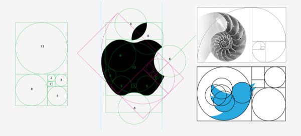
There is amazing balance in nature and science. This is the Golden Ratio and it is roughly equal to 1.618. If you know the Fibonacci sequence, you’ll know what I’m talking about. What does this have to do with logo design? Artists have long believed that the Golden Ratio is the most visually appealing ratio to the eye. You can achieve balance in your designs by adhering to this ratio.
Clearly, there’s a lot more to a logo than meets the eye! Hiring a professional designer or design agency will help your brand be memorable, timeless and stand out against your competition. Or, you can get a friend or family member to design a logo with a swoosh around it, and be similar to a million other companies.


