 Blog Home
Web Design Trends to Watch: Modernizing Your Online Presence
Staying abreast of design trends is imperative for crafting captivating, user-friendly, and aesthetically pleasing websites. At HTC, we are always ahead of the curve, and our Web Design Services are no exception! Let’s delve into five cutting-edge web design trends that promise to modernize your online presence and captivate your audience.
Dark Mode: Elegance in Simplicity
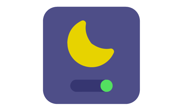
Dark mode, once a niche choice, has emerged as a dominant trend in web design. This sleek interface style not only reduces eye strain in low-light environments but also adds a touch of sophistication. Dark backgrounds enhance visual contrast, allowing vibrant elements to pop, creating a captivating user experience.
By offering a choice between light and dark modes, websites cater to diverse user preferences, empowering visitors with control over their browsing experience.
Asymmetrical Layouts: Breaking the Mold
Asymmetrical layouts inject vitality and dynamism into web design. Breaking away from the conventional, balanced designs, these layouts introduce a sense of creativity and uniqueness. They create visual interest by embracing irregular shapes, overlapping elements, and off-centre placements.
When executed thoughtfully, asymmetry draws attention, guides the eye, and fosters a memorable user experience.
3D Elements and Illustrations: Adding Depth and Engagement

The integration of three-dimensional elements and illustrations breathes life into websites. By leveraging advancements in technology, 3D visuals bring depth, realism, and interactivity to web design. These elements captivate visitors, creating immersive experiences that set brands apart.
From 3D product showcases to interactive storytelling, incorporating such visuals elevates engagement and leaves a lasting impression on users.
Bold Typography: Making a Statement
Typography isn’t merely about readability; it’s a design element that communicates brand personality. Bold, attention-grabbing typography is gaining traction as a centerpiece in web design. Large, expressive fonts command attention, creating focal points and conveying messages with impact.
Combining bold typography with creative layouts enhances visual hierarchy, guiding users through content while making a bold statement about your brand’s identity.
Mobile-First Design: Prioritizing User Experience

With mobile users dominating online traffic, prioritizing mobile-first design is no longer an option—it’s a necessity. This approach focuses on designing for smaller screens first, and then adapting to larger screens after, ensuring seamless and intuitive experiences across all devices.
By emphasizing responsive design, streamlined navigation, and touch-friendly interfaces, mobile-first design caters to the preferences and behaviors of on-the-go users, optimizing engagement and conversions.
At HTC, we create stunning, functional, and responsive designs that deliver engaging user experiences, reinforce your brand identity, and prioritize exceptional user experiences (UX) and visually appealing user interfaces (UI).
Download our 17-Piece Digital Marketing Toolkit for more information on our Web Design services.